International Journal of Scientific & Engineering Research Volume 2, Issue 11, November-2011 1
ISSN 2229-5518
Visualization Approach to Effective Decision
Making on Hydrological Data
Faudziah Ahmad, Khairul Bariah Ahmad, Azliza Othman
Abstract— Temporal data is by nature arranged according to the sequence of time where the order of the data is very significant. Thus in order to visualize a temporal data, the order of the data has to be preserve that will show certain trends or temporal patterns. Most visualization technique however uses technical visual representation such as bar chart and line graph. This approach is suitable and can be easily comprehended only by technical users. In order to reduce the learning curve in understanding the prototype develop and facilitate decision making, metaphor based visualization approach was used for representing temporal hydrological data. To evaluate the correct of decision making similarity test was conducted by using data mining approach, specifically incorporating case-based reasoning. The test case or new data was compared with the case extracted from previous operation data and the case closely was examined by exploring the detailed data. Results were evaluated through usability testing and similarity testing. The prototype was demonstrated to a group of users specifically three DID staff involved with the dam operation directly and indirectly. The feedbacks received from the users are positive where the interface objects used took a short time for them to learn and understand due to the familiarity of the representation. One look at the map, it will give them the overall picture of the situation patterns of the dam water level and rainfall around the catchments area according to the time frame chosen. The metaphorical representation based visualization is used as a basis to represent temporal and multi-variate data using icon based technique and colour code to enhance interface usability and usefulness. This type of representation can be easily understood by a non-expert from the domain. The visualization actually assists users in the process of decision-making by representing the patterns in form close to the mental model of a user by using metaphor. This help speed up data exploration thus decision-making process. In critical situation speed and accuracy is vital in the decision making process.
Index Terms— Temporal, Visualization, Hydrology Data, Decision making.
—————————— ——————————
1 INTRODUCTION
isualizing hydrological data is an effective way to capture unnatural patterns or trends that may lead to destruction to human lives. In critical de-
cision making such as releasing dam water to prevent dam outburst, timeliness and accuracy of decision is most important [8]. A slight mistake in decision will cause catastrophic event that can harm public safety and properties. One critical problem faced by dams is unexpected sediment or silt that deposit below the dams and causes dams to lose their total water capaci- ty. For example, Timah Tasoh Dam, which is located at the north of Malaysia, can store up to 40 million cubic meters when it started operation in 1992. After
14 years of operation, the current total storage capaci-
ty in Timah Tasuh Dam is less than 40 million cubic
meters at the normal pool. The dam gate operation
guideline used 14 years ago, thus needs to be adjusted
to suit the new situation. The new situation also re-
quires the dam engineer to manually recalculate the
rainfall and water level at the dam before they can
————————————————
Faudziah Ahmad is currently lecturing masters program (MSc(IT)) at
Universiti Utara Malaysia, Malaysia, PH-6049284788.
E-mail: fudz@uum.edu.my
Khairul Bariah Ahmad is currently lecturing degree program in IT at Un-
iversiti Utara Malaysia, Malaysia, PH-6049284616.
E-mail: kbariah@uum.edu.my
Azliza Othman is currently lecturing lecturing degree program in IT at
Universiti Utara Malaysia, Malaysia, PH-6049284647.
E-mail: azliza@uum.edu.my
make a decision on opening or closing a gate. Miscal- culation by the dam engineer could cause inaccurate decision which may lead to tragedies such as loss of human life and property.
In the case where a new engineer takes over the task, decision making is riskier as the person is lack of ex- perience and do not fully understand the dam opera- tion procedures.
The integration of visualization and data mining is one way to improve understanding and facilitate de- cision making [5, 13, 3, 19]. This is because visualizing abstract data amplifies cognition and makes data more inference and understandable [13, 2, 4, 16]. The advantage of visualization is that it is intuitive, does not call for understanding of complex mathematical, statistical formulas or algorithm, capable of being un- derstood by non-expert users, and can handle very large volume of data with huge amount of informa- tion. Visualization of temporal data causes certain issues such as how to present continuous data, how to show the order of data sequentially, and how to pro- duce visualization that can be understood by non- experts.
According to [10], a metaphor framework for visualization will promote meaningfulness due to fa- miliarity and at the same time promote an under- standable mental model for non-experts. Information visualization that closely resembles the mental model of the users can help reduce the learning curve of us- ers in using the system by providing graphics that are familiar to them and their surroundings. User ori-
IJSER © 2011
http://www.ijser.org
International Journal of Scientific & Engineering Research Volume 2, Issue 11, November-2011 2
ISSN 2229-5518
ented design was proposed for visualization graphics. User involvement in the early design stage is crucial in order to obtain suggestions and feedbacks that are meaningful. This paper presents a metaphor based visualization approach for temporal hydrological data. It particularly describes the process of visualiz- ing data and visualizing patterns, and presents two methods to evaluate visualization prototype.
In temporal data, time and sequence are two most important aspects of data that must be closely moni- tored. Storing and processing a time based data must preserve the natural order of data so that no informa- tion loss is experienced. Retrieving and indexing records according to the time sequence is main task in managing temporal data. From temporal data, trends and temporal patterns can be extracted to give an insight of certain knowledge [8]. However, the point of change in a temporal data is an important piece of information that needs to be detected as prompt and accurate detection will help to reduce de- lay in decision making [18]. Visualization of temporal data can assist user in recognizing trends, patterns and detecting change. This is because users are able to choose the time range to look for trends and patterns visually. The temporal information presented visual- ly is much easier to comprehend that just looking at a series of numbers and with the support of automatic computation, information can be effectively unders- tood [3].
In terms of decision making, information visualiza- tion and visual data mining can deal with large data sizes. Information visualization deals with how to visually present information and makes data more inference and understandable [4]. Visual data mining is a collection of interactive reflective methods that support exploration of data sets by dynamically ad- justing parameters to see how they affect the informa- tion being presented. In the last few years, several ef- forts have been made to integrate visualization and data mining [17, 6, 14, 3]. The integration was meant to increase the effectiveness of visualization process. Visual data mining technique have proven to be of high value in exploratory data analysis and they also have high potential for exploring large databases.
Successful visualization system has to be built to satisfy universal-usability for diverse users regardless of their backgrounds or technical disadvantages. Such system though necessary becomes a huge chal- lenge for developers. [12] stated that development process requires higher software development skills, complex requirements, tedious development process, and understanding and integrating mental models. Mental model aspect has been seen to be investigated in visualization research in various ways. [1] and [5] studied on human perception and claimed that hu- man perception through the visual representation ca- pable of straightforwardly identify the data relation- ships when it is 2 or 3 dimensional but for multi-
variate data, it is very difficult to identify the relation- ships manually. [11] and [7] reported that manual visual data exploration is time consuming and may produce incorrect conclusion when certain tasks takes too much time. For example, finding the right para- meter is very tedious and sometimes is almost im- possible.
[5] investigated the ability of certain human to understand what the visualization shows and to perceive the identified pattern into meaningful hypo- thesis. His results showed that different peoples perceive differently due to dissimilar background and domain knowledge. He suggested an integration of established technique such as machine learning and statistical because the automatic and visual data min- ing exploration combination utilize the human intui- tive cognitive skills and computer efficiency. This in- tegration will permit speedy and efficient detection of interesting pattern and trend in data.
2 APPROACH VISUALIZING HYDROLOGICAL DATA
The approach consisted of five main steps: task analysis, data characterization, display mapping, prototyping, and evaluation. The task analysis is a process of observation and interviewing end users and is intended to understand how users currently accomplish their tasks. Data characterization is a process of characterizing data attributes to be used in the display mapping step. Sample of data are first transformed to a data table. Rows represent particular cases and columns are features of the case. The display mapping process maps data into visual structure based on text, color and icon. A prototype is developed to show how visual representations can be used to discover patterns in hydrological data and make decisions based on the patterns. The effectiveness of the decision making based on the visualization system is evaluated for usability and similarity. Figure 1 shows the entry and exit criteria for each step
IJSER © 2011
http://www.ijser.org
International Journal of Scientific & Engineering Research Volume 2, Issue 11, November-2011 3
ISSN 2229-5518
and cannot be randomized. The study uses multi- variate data that includes two types of data: daily rainfall measurement and reservoir water level. The rainfall causes water level at the reservoir to rise but the rise will occur after some delay. Equation 2 shows the fork mula:
wt wt 1 ri ,t d
i 1
for k 0 (2)
3 RESULTS
Figure 1: Steps for the approach
where w is the water level at time t , r is the rainfall at k number of collecting stations, d is delay and some constant number. Delay d represents a timeframe where a rainfall r has influence on water level w after some time. The time delay here gives important in- formation to the domain expert and will be used for making decision to release or not to release excess wa- ter from the reservoir through the spillway gate open- ings.
Based on the information above, a visual temporal encodings is created to ensure that it can be reflected by the movement of change to a particular visual structure property over time.
The exit criteria of this step are types, priorities and sources of the data that will be used in the dis- play mapping step. This step focuses on describing the mapping of data attributes (from the data charac- terization step) to a display artifact. A visual meta-
Results for each step described in section two are pre-
sented.
Task Analysis
An interview was conducted with the dam technician
of Timah Tasoh Dam situated in Perlis, a state at the
North of Malaysia. The aim was to seek information
regarding the management of day to day reservoir
operation. Data and users’ requirements were col-
lected from the Drainage and Irrigation Department
(DID), a government unit that is responsible on the
reservoir operation management. The data consists of
hydrology information such as rainfall measurements
at six stations and reservoir’s water level. The inter-
view was transcribed and a list of user tasks in se-
quential order was produced.
Data Characterization
The hydrology data used in this study are temporal
data sets that contain dynamic data. These data
changes in time continuously and are constantly up-
dated. The changes are sequential in a successive
time frame and can be a regular or unpredictable
event. It has special characteristics. An event e at time
current time, tn , is influenced by previous event e at time tn-i where n-i +1 is the previous number of time
index. Thus, an event can be represented as Equation
1.
phor is used to produce a display mapping. It in- cludes concepts of movement, animation, rhythms and cycles [12]. The mapping is then represented to a design artifact by creating a set of storyboards. The storyboard will be used to design user interfaces.
Display Mapping
Colour codes proposed by the Drainage and Irriga-
tion Department (DID), Malaysia has been used to
indicate water levels in rivers and reservoir. Green
stands for Normal situation, yellow for Alert, orange
for Warning and red for Danger. These colors are only
applicable for the Timah Tasoh dam. Figure 4.1
shows the information regarding the colors used.
Figure 4.1: Colour Code for Water Level
A map surrounding the dam was used to indicate the upstream and downstream area especially the lo- cation of the rainfall stations and incoming river flow.
Based on discussion with the dam technician, icons were used to represent the rainfall measure- ment. Commonly used icons were chosen to repre- sent data values that falls into several categories. The
e e e
n1 n ni
(1)
icons chosen are based on small images commonly
which means that future event is the effect of previ-
ous events occurred in the time index. Hence event

used by the Meteorological Department, Malaysia and the Malaysian news telecast. No Rain is repre-
e e e
n1 n ni
indicates a temporal pattern. As


sented by , Light rain, moderate rain and heavy
shown in Equation 1, the event is temporally continu-
ous that implies the sequential ordering is important
rain are shown with , , . Very heavy rain is represented with
IJSER © 2011
http://www.ijser.org
International Journal of Scientific & Engineering Research Volume 2, Issue 11, November-2011 4
ISSN 2229-5518
Representations used such as colour codes, map, and icons are objects that are familiar to users and thus can be associated with user’s mental model.
Prototyping
Prototyping is the product development phase. It in-
volves transforming the specified design from the
previous step into an application. As mentioned ear-
lier, icons were used to show trends of rainfall and
dam water level. A user can select the time frame (n-
i+1) as shown in representation Equation 1. A user
can choose a minimum of two days and up to a
maximum of seven days.
The minimum and maximum days allocated are due
to the limitation of the standard computer screen.
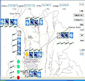
Figure 4.3 illustrates an example of the screen shot.
that shows a four days trend in rainfall and reservoir
water level data. The event at day 4 is influenced by
event at day 1, 2 and 3. The rainfall around the
catchments area at day 1, 2 and 3 caused a significant
water rises at the reservoir as indicated by the red cir-
cle in the map. The icon displays actual data (shown
by the date indicator) that was used in a real opera-
tion of the Timah Tasoh dam.
Evaluation
Usability test was used to evaluate the prototype. The
prototype was demonstrated to a group of experts.
These experts include three DID staffs involved with
the dam operation directly and indirectly. The experts
evaluated the prototype by walking through their
daily routine tasks with the system. This evaluation
technique is known as cognitive walkthroughs [9]. Dur-
ing the walkthrough, a usability test was used to eva-
luate the performance of the application in terms of ease of use and ease of learning goals that were laid out in the goal setting task. The overall feedback was positive. Users found that visualization through rep- resentations based on users’ mental model made them easy to remember thus speed up their process of learning.
Similarity test involves testing and training a selected
temporal dataset. The dataset was partitioned into
two sets, training and testing. Case-based reasoning
was used to check for similarity search on cases in the
training set with cases in the testing set. The similari-
ty search process was transformed into a visualization
mode for the user to explore and examine. The user
can compare the test case or new data with the case-
based extracted from the previous operation data.
Users can examine the cases closely by exploring the
detailed data. Thus, user decision-making can be faci-
litated by visualization of cases, similarity search and
detailed examination.
5 DISCUSSION AND CONCLUSION
Metaphor based visualization approach for hydro- logical data: The focus of the study is on the process of transforming hydrological data into visual data and making decision based on patterns produced.
As mentioned earlier in the paper, currently the process of deciding to open or close the Timah Tasoh Dam is conducted following written procedures es- tablished by DID. As the capacity of the dam changes due to deposits settlement at the bottom of the dam, recalculations by a dam engineer is made to adjust to the new situation. Thus, the recalculated data and other information can only be understood by the dam engineer himself.
The issue is ―what if a new engineer takes over
the job – can he immediately understands the process and able to make correct decisions?‖ or ―can he un- derstands the figures?‖. Making correct decisions is
crucial in critical situations such as dam water reach- ing critical level. In such cases, several decisions is needed on opening or closing (i) ―how many‖ gates, (ii) ―which‖ gate(s), and (iii) ―when‖.
A correct decision can save lives and properties in the surrounding area. A metaphor-based approach for visualizing hydrological data has been designed to facilitate a dam engineer or related field worker to make a decision in opening or closing a dam. The approach consists of five main steps task analysis, da- ta categorization, display mapping, prototyping and evaluation.
Visualization of temporal data and patterns: The me- taphor-based approach focuses on how information is interpreted from changes over time. The visualization representation process is being done in the display mapping step.
IJSER © 2011
http://www.ijser.org
International Journal of Scientific & Engineering Research Volume 2, Issue 11, November-2011 5
ISSN 2229-5518
In the display mapping step, visualization of the tem- poral data and visualization of temporal patterns are constructed. Visualizing temporal data aims to make data more inference and understandable [4] while vi- sualization of patterns include uncovering patterns and trends in the hydrological data. [7] and [1] men- tioned that the basic of visualization technique is to represent the data into certain visual form that human being can directly interact with the data to gain in- sight from the pattern recognition and then to come out with hypotheses.
Here, mental models concepts are applied to identify visual forms or objects that could relate to the hydro- logical data. Discussion with users and observations confirms selected objects/ representations. Specific icons representing water level, and rainfall measure- ment that is familiar in context with users were cho- sen for the user interface. Visualization of patterns is representation of data changes.
For Timah Tasoh, changes are represented with colour codes. Water levels categories are represented by three colours, green, yellow and red. Green shows Normal situation, yellow means Alert, orange is Warn- ing and red represents Danger. The colours have been chosen as these are standard colours that have been used world widely on hydrological data. The icons and colour codes were chosen to represent the data values according to the category that has already been used by DID. The icon chosen is based on small im- ages commonly used by the Meteorological Depart- ment, Malaysia and Malaysian news telecast. This fact supports familiarity of the icons and can be associated with users’ mental model.
The approach is seen to be an advantage as the current technical representation has been argued to be understood only by technical experts. In this study, a user oriented approach has been used to perform task analysis such as decision-making process, identifying a suitable metaphor that is familiar to the users. The aim is to reduce the learning curve in understanding the system or prototype developed. A map (Figure
4.3) gives the user an overall picture of the situation
or known as ―patterns‖ of dam water level and rain-
fall around the catchments area according to various
time frames.
Evaluation: The prototype produced is a metaphor
based approach. It is meant to show the feasibility of
integrating visualization and data mining to facilitate
decision making on hydrological data. The usability
of the prototype has been analyzed in terms of usabil-
ity and similarity. The usability test has been con-
ducted based on cognitive walkthroughs [9]. Users have
been observed to understand the visual representa-
tions and visual patterns displayed. The results indi-
cate that the use of user-oriented approach to identify
suitable representations produces satisfaction and
speeds up understanding process. The incorporation
of mental models in visualizing patterns produces
positive effects on decision making process and infe- rences. The finding provides important clues for sys- tem designers.
Similarity test was conducted to evaluate the cor- rectness of decision making. The test was conducted using data mining approach, specifically incorporat- ing CBR. The approach was inspired by [0] in which his exploration on integrating machine learning, sta- tistics, data mining and visualization with human in- tuitive cognitive skills and computer skills produce positive results. This integration resulted speedy and efficient detection of interesting pattern and trend in data. The visualization made on the similarity test process produces an easy checking mechanism. A user can compare the test case or new data with the case extracted from previous operation data. Users can examine the cases closely by exploring the de- tailed data. Thus, user decision-making can be facili- tated and enhanced by visualization of cases, similari- ty search and detailed examination.
Visualizing hydrological data is one way to facili- tate decision making. The visualization process has been conducted through a set of steps. The display mapping is the step that handles the visualization re- presentation tasks, visualization of temporal data and visualization of temporal patterns. Machine learning and data mining are integrated with the visualized data to manage decision making. Results were eva- luated through usability testing and similarity testing. Visualization when applied to hydrological data has been found to facilitate users in the process of deci- sion-making. This because through metaphors, that is representing patterns in the form that is close to the users’ mental model, improves understanding, speeds
up data extraction and thus enhance decision-making process. In critical situation such as flood relieves, speed and accuracy is vital in the decision making process. Thus, visualized hydrological data can help technician in making correct and efficient decision in a short time. Among the problems faced during re- search is to understand the mental model of the tech- nical people and decision-makers involved. However through the task analysis, user observation and walk- through, adjustments in the application have been made.
ACKNOWLEDGMENT
The authors wish to thank the Malaysian Government for providing funds to support the research.
REFERENCES
[1] Aguilar-Ruiz, J., & Ferrer-Troyano, F, Visual data mining. Journal of Universal Computer Science, Vol.11, No.11, 2005, pp.1749–1751.
IJSER © 2011
http://www.ijser.org
International Journal of Scientific & Engineering Research Volume 2, Issue 11, November-2011 6
ISSN 2229-5518
[2] Bederson, B. B. and Shneiderman, B. The Craft of Information Visualization: Reading and Reflections, Morgan Kaufmann Oublishers, 2003.
[3] Bertini, E. and Lalane, D., Investigating and
Reflecting on the Integration of Automatic Data Analysis and Visualization in Knowledge Discovery, SIGKDD Explorations, Vol.11, No.2, 2010, pp.9-18.
[4] Brodlie, K.W., Duce D.A., Gallop, J.R., Walton, J.P.R.B. and Wood, J.D., Distributed and
Collaborative Visualization, Computer Graphics
Forum, Vol. 23, No.2, 2004, pp.223-251.
[5] Demsar, U., Data mining of geospatial data:
combining visual and automatic method. Ph.D. Thesis, Royal Institute of Technology (KTH), 2006.
[6] House, D., Bair, A. and Ware, C., On the optimization of visualizations of complex phenomena,
Visualization. VIS 05. IEEE, 2005, pp. 87- 94, 23-28
Oct. 2005.
[7] Kiem, D.A., Information Visualization and Visual
Data Mining. IEEE Transactions on Visualization and
Computer Graphics. Vol. 8, No. 1, 2002.
[8] Norwawi, N. 2004. Computational RPD Model based on Temporal Data Mining Approach in a Multiagent Environment for Flood Emergency Response Operation . PhD Thesis, Universiti Utara Malaysia,
2004.
[9] Preece, J., Rogers, J., and Sharp, S., Interaction Design: beyond human-computer interaction. 2nd Ed., John Wiley & Sons, Inc. 2007.
[10] Robinson, N. and Shapcott, M., Data Mining Information Visualization – Beyond Charts and Graphs, Proceedings of the 6th International Conference on IEEE Information Visualization, 2002.
[11] Schneidewind, J., Sips, M., & Keim, D. A., An automated approach for the optimization of pixel- based visualizations. Information Visualization, Vol.6, No.1, 2007, pp.75–88.
[12] Shneiderman, B. & Plainsant, C., Designing the User Interface: Strategies for effective Human-Computer Interaction, 4th edition. Addison Wesley, 2005.
[13] Spence, R., Information Visualization, Addison- Wesley, 2001.
[14] Staiano, A., Ciaramella, A., Raiconi, G., Tagliaferri,
R., Amato, R., Longo, G., Miele, G., Donalek, C., Data visualization methodologies for data mining systems in bioinformatics, Proceedings IEEE International Joint Conference on Neural Networks, Vol.1, 2005, pp.143- 148.
[15] Teoh, S. T., Zhang, K., Tseng, S.-M., Ma, K.-L., & Wu, S. F., Combining visual and automated data mining for near-real-time anomaly detection and analysis, Proceedings of the 2004 ACM workshop on
Visualization and data mining for computer security,
2004, pp.35–44.
[16] Ware, C., Information Visualization: Perception for Design: Second Edition. Morgan Kaufmann Publishers, 2004.
[17] Zhao, K., Liu, B., Tirpak, T.M., Xiao, W., A Visual
Data Mining Framework for Convenient Identification of Useful Knowledge, Fifth IEEE International
Conference on Data Mining, 2005, pp.530-537.
[18] Tanin, E. Zhang, R. and Kulik, L., Spatio-temporal Database Research at University of Melbourne, SIGMOD Record, 2009, Vol.38, No.3, pp.35-39.
[19] Zakaria, Z., Knowledge Discovery Query Language (KDQL), Proceedings of the 12th Wseas International Conference on Computers, 2008, pp.497-519.
IJSER © 2011
http://www.ijser.org