International Journal of Scientific & Engineering Research, Volume 2, Issue 4, April-2011 1
ISSN 2229-5518
A Chart for General and Complicated Data
Visualization
M Siluvairajah
Abstract— Massive datasets arise naturally as a result of automated monitoring and transaction archival. Military intelligence data, stock trades, retail purchases, medical and scientific observations, weather monitoring, spacecraft sensor data and censors data are all examples of data streams continuously logged and stored in extremely large volumes, which create the need for innovative data vi- sualization solutions. Although, there are many on-going researches and developments on this field recently, there are only few solu- tions to visualize information for general public. In this paper, I explore different methods to use ManoStick chart to visualize informa- tion.
Index Terms—data visualization, chart, graph, manostick
1 INTRODUCTION
—————————— • ——————————
There is a range of visualisation tools with a range of functions, such as;
• Comparison of values with bar charts, block his- tograms, bubble and matrix charts
• Tag clouds to view word popularity in given text
• Data point relationships with network diagrams and scatter plots
• Parts of the whole can be visualized with pie charts and tree charts
• Track trend changes as rises and falls over time with line graphs and stack graphs
• And many more different attempts to visualize large scale information with complicated algo- rithms to use by researches and analysts.
However, not all are suitable to current needs and prob- lems at hand.
Some visualization methods such as bar charts, pie charts and line graphs, are many decade old which had been created for the light-information on that time.
Some modern visualization [2] attempts such as Internet Visualizations are too complicated. According to psychol- ogist George Miller [3], who in a seminal paper in 1956, noted the cognitive “information bottleneck” that percep- tion and attention span impose on the amount of informa- tion people “are able to receive, process, and remember.” In this otherwise serious essay, Miller suggested that sev- en independent items of information, plus or minus two, might represent the limit of what most people can grasp in one moment.
According to Friedman [1], the main goal of data visuali-
zation is its ability to visualize data, communicating in- formation clearly and effectively. It doesn’t mean that data visualization needs to look boring to be functional or ex- tremely sophisticated to look beautiful. To convey ideas effectively, both aesthetic form and functionality need to go hand in hand, providing insights into a rather sparse and complex data set by communicating its key-aspects in a more intuitive way. Yet designers often tend to discard the balance between design and function, creating gor- geous data visualizations which fail to serve its main purpose — communicate information.
We can summarize that solutions for data visualization should be compact, based on known concept, easy to un- derstand and able to express.
2 BACKGROUND
Introduction to ManoStick chart [4]: ManoStick chart has five microstructures as shown on figure 1 & 2, which are
1. Upper tail
2. Upper body
3. Middle body
4. Lower body
5. Lower tail
Each microstructure represents 20% of the depth or popu- larity, which could be quantity when working with sales, volume when working with equities etc. ManoStick chart is better suitable for variable data with depth.
To create a chart, we need to sort the variable data, find the total depth and divide the total depth with five as there are five microstructures in Mano Stick.
IJSER © 2011
2 International Journal of Scientific & Engineering Research, Volume 2, Issue 4, April-2011
ISSN 2229-5518
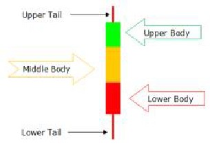
Figure 1
Now, first data set represents upper tail, the second data set represents the upper body and so on.
To differentiate microstructures, we can use different co- lours or patterns. Number five is convenient here as eve- ryone used to it ever since the invention of analogue clock. When the whole divided by five, we get 20% which is each macrostructures weight.
Having four microstructures against one is rule of 80/20. Italian economist Vilfredo Pareto created a mathematical formula to describe the unequal distribution of wealth in his country, observing that 20% of the people owned 80% of the wealth. This opens up possibilities to analyse data even with single stick.
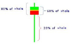
Figure 2
3. IMPLEMENTATION
What sort of data visualization might help city planners to track their population? Think of a city like Paris where thousands of people move in, move out, babies born and old people pass away. City planners are in constant chal- lenge to offer amenities, education, health care, transport and etc. while businesses need to supply the necessary products and services.
Here, we can create a time series graph, example
monthly, using ManoStick chart. Each ManoStick is to represent the age of population for that month. By look- ing at the graph, we can translate lot of information easi- ly.
We can answer representative questions such as; what is the oldest age? what is the mean average?, what age group of people are highly populated? what age group of people are least populated?
We can answer comparison questions such as; what is the difference from oldest age between two months? What age groups of people are growing from previous month? Is the average age is high or lower than the previous month?
In addition, it is possible to zoom microstructure in the form of ManoStick for deep analysis. We can continue this process as long as there are data and analysis with other soft of data such as their income in one group against the other etc.
Further, we can divide ManoStick vertically to represent to different set of data in this case, one side to represent males and the other side to represent females.
4 CONCLUSION
We have seen that ManoStick charts are able to visualize the depth, can be easily learned even by general public and take only small space to display. It can be used to represent, compare and spot trends as well as expandable with zooming. Now, it is possible to distribute more in- formation easily to general public with a chart instead of average house price, tomorrow’s temperature, cricket players batting score, children’s exam result, people di- agnosed with cancer or deceased people on the city last month. It opens up many more opportunities not only for statisticians but also for general public.
REFERENCES
[1] Vitaly Friedman (2008) "Data Visualization and Info graphics" in: Graphics, Monday Inspiration, January 14th, 2008.
[2]http://www.webdesignerdepot.com/2009/06/50-great- examples-of-data-visualization/
[3] Miller, George A. “The Magical Number Seven, Plus or Minus Two: Some Limits on Our Capacity for Processing Information.” The Psychological Review, 1956, vol. 63, pp. 81-97.
[4] M Siluvairajah, ManoStick: An Ariel View of the Stock Market,
2009, pp.84-91 ISBN 978-0956395603
[5] Review of Visualization in the Social Sciences: A State of the Art Survey and Report by Scott Orford, Daniel Dorling and Richard Harris, 1998.
IJSER © 2011